Hey guys,
I know I have been a little quiet this week and unfortunately didn’t manage to release a new video on my YouTube channel.
I have actually been spending most of my evenings working on a new version of my website. There were a number of improvements I wanted to make and a number of issues I needed to fix. Instead of releasing the new version silently, I figured it might be interesting to explain what has changed – and why. Maybe this post will give you some insights and some tips for setting up, or tweaking, your own website. Or maybe it’ll just make for an interesting read.
New Website Header
My old header was quite wasteful with space. It was a big banner image across the top of the page. While I wanted to keep my branding, I wanted to make sure the content of my site would move up a little further so it was more easily accessible, especially on devices with limited screen real estate. I ended up compressing the banner height and I renamed a few of the menu items to make them more descriptive.

I also unwrapped some of the nasty HTML I had written for the previous version and added a text based tagline to the header. My hope is that it will make it a little easier for Google to crawl and identify the navigation and content in my site.
Featured Slider Moved to Sidebar & New Social Media Links
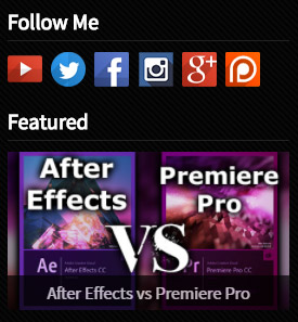
My old website had all of my social media links embedded in the banner. However, a lot of people did not notice that they were actually links and thus never clicked on any of them. I have decided to move the social media icons out of the banner and into the sidebar under a ‘Follow Me’ section to make them more prominent – and hopefully more likely to be clicked.

I have also decided to move the humongous featured content slider away from the top of the home page and into the sidebar. I much prefer my latest content being at the top of the home page as opposed to featured content, which changes a whole lot less frequently.
New Tutorial Grid Layout
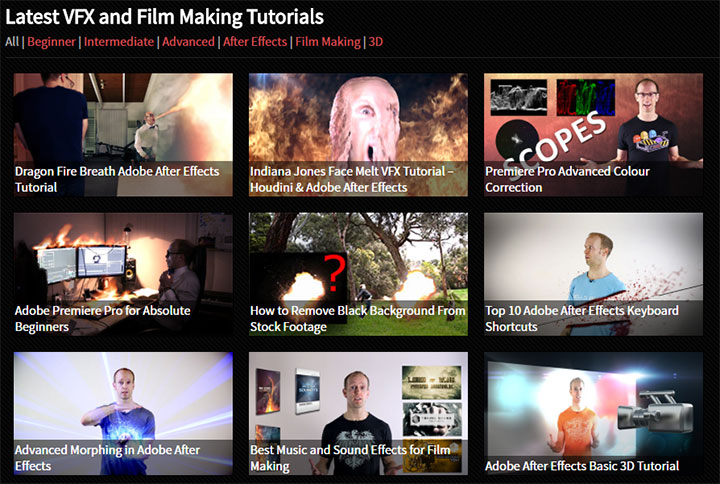
My old tutorials page looked pretty messy and cluttered. I decided to revamp the tutorial layout entirely and went with a much neater grid layout that features prominent images and the tutorial titles overlayed within those images. Not only does that allow for more content to be visible on a single screen, it also makes it easier to scroll through and click on the desired content on a mobile device. I have applied this grid to the Tutorials, Films and Product Reviews sections on my site.

Additionally, I have added some visual feedback to hovering over the images and re-introduced the typical underline hover-over effect for text links. Hopefully that will make it easier for people to navigate my site and discover my content.
Google Recaptcha Integration
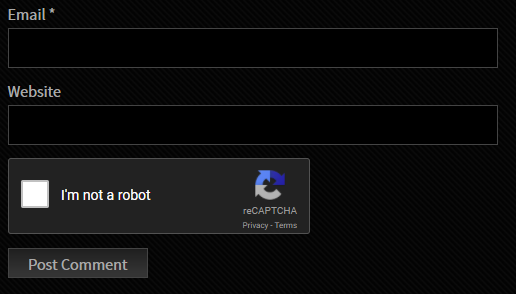
For a long time, I was relying on some custom WordPress plugin to protect myself from Spam. I decided to strip out a whole lot of custom code and integrate the Google Recaptcha into my website – both for visitor comments and for my main contact form.
Because I was using custom plugins, for a while users could not even comment at all after I upgraded one of my plugins. Instead, they saw 2 CAPTCHAs on the comment page and the form submission would fail every time.

The goal was to be more standard compliant, make the comments easier to use for my visitors and move away from custom solutions that would not survive me upgrading my WordPress plugins.
New Comment Style – Gravatars
While removing custom code around dealing with the comment form and CAPTCHA on my site, I decided to also strip out a lot of custom code for formatting the comment section. On top of that I decided to re-organised my CSS and re-introduced support for gravatars so people could use their own icons in my comment section. I simply think it looks a little nicer and more interactive that way.

rel=nofollow Links to Avoid Google Penalties
To be frank, my website has never ranked terribly well on Google. Maybe because I do not put out content frequently enough, maybe the structure of my website isn’t SEO friendly enough, maybe I was using too many links that took the user away from my site.
I do like linking my visitors across to great sites such as Video Copilot, ActionVFX or HitFilm. However, most of my links did not have the rel=”nofollow” tag.
This tag is important when Google crawls your site as it tells the crawler that this link leads away from YOUR content and away from YOUR property and brand. If you do not use the nofollow tag, Google might get confused or it may assume you are trying to mislead your visitors and thus potentially penalise your page in ranking.
To be on the safe side I opted to add rel=”nofollow” to a lot of the links on my site. There are still a lot of pages to go through, but I think I have hit the biggest culprits and will have to see if the change will have an impact on ranking in the long run.

Final Words
Running a website and trying to reach a large audience is not an easy task. I am not an expert in SEO or analytics and I simply want to make a website that you guys enjoy using and that Google can consume easily to spread around the world.
Please let me know in the comments down below (should now work again!) what you guys think – do you like the new site? Do you hate it? All feedback welcome :)


2 Responses
It loads faster Tobias. Making changes to a wordpress site to be SEO compliant can be a pain, but you’re on the right track, good job!
Thank you for the feedback, that’s good to hear! I do know a fair bit about SEO, but I’m no expert and without strong analytics (and the means to understand them) it’s always a bit of black art. I’ll monitor my stats and see how things go over the next few weeks!